Pixel brushes: Painting in Affinity Designer (or Affinity Photo)
- Isabel
- Apr 12, 2022
- 11 min read
Updated: Jun 30, 2025
In this tutorial we are going to create a fauvist still life using the only the Pixel persona brushes and mostly, saturated bright colours.
It is true that we could also be combining both personas, but I will stick to using only bitmaps and not a single vector path in this occasion.
Take this Affinity Designer (or Affinity Photo) tutorial, and as an exercise to introduce or advance in the use of pixel brushes, which I often see some people struggle with and even dread. Feel free to share it with others in this situation.

Final Artwrok
If you want to request a tutorial, you can leave a comment here
1. Document settings
For this document, as I usually recommend, I am going to think ahead. I want my painting to be potentially printable, so I will make it big enough in both, dimensions and resolution.
I make a new Affinity Designer or Affinity Photo document of 3700 x 3000 px and set the type to "Print". The DPI is set to 300.
2. Pixel brushes vs. Vector Brushes
We are now on the Pixel persona in Affinity Designer, remember to switch from the Designer persona because as I said, we will be working everything here today.
Now open the Brushes panel (View>Studio>Brushes).
If you are not familiar with the Personas in Affinity Designer, you probably need to know that the panels in them are independent from each other.
This means that, even when they are called the same, they are not the same.
For example, if you open the Colour panel in the Designer persona but switch to the Pixel persona and you didn't open it there, you won't see it in the interface anymore until you open it.
This said, it is important to understand that the brushes on the Pixel persona are not the same as the brushes found in the Designer persona.
The same applies for when you import or install new brushes into Affinity Designer.
The brushes imported in the Brushes panel from any of the personas will only show in that specific environment.
In any case, it is interesting understanding how they are different.
Pixel brushes are based on bitmaps (images). This means that you need to be aware that, despite the fact they have many ways to be customised to our convenience, we need to be careful and use them without scaling them more than they allow us to.
If we don't, we will produce pixelation. They have a maximum size, depending how they were created and it is not recommended to make them any bigger to avoid the said pixelation.
This is why it is important to use quality brushes that will allow for proper resolution when scaled.
In the image below you can see an example of this, with a brush that has been applied using different sizes.
As it is visible, when used at 200px it is still not showing much pixelation, but as we increase the size to 400 or even 800px, it shows jagged and blurred edges.
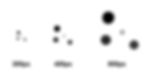
Pixel brush at different sizes. Avoiding jagged edges and blurriness is key.
Regarding Vector brushes in Affinity Designer, it is also important to point out that, even though they are called "Vector" brushes, they are actually not exactly that.
* Vector brushes in Affinity Designer are actually bitmap images attached to paths
This means that the same applies to them, and the main difference (although not the only one) with the pixel brushes is that we can work manipulating its shape using nodes and tracing with the Pen tool if we wish to do so.
A good example of how this works is presented in the Affinity Designer Vector brush category called "Image".

Vector brushes in Affinity Designer
Other applications such as Adobe Illustrator, have vector brushes built out of mathematical operations, this is, real vector brushes, but it is important to differentiate the different nature of these when compared to the ones found in Affinity Designer.
3. Blocking the background with paint
Now, on the Pixel persona, pick a brush for the background and adding a Pixel layer in the Layers panel, paint what will be the base or floor for the dead nature.
I have picked a brush from the Dry Media kit. I recommend you test which one works best for you to paint this base. In reality most brushes in that kit will work and we need to make it a big size to cover as much surface as possible with just one stroke.

Initial brush stroke for the base
As you see, I initially made it blue. I thought I'd go for something colder in colours but later on I changed my mind as you'll see.
Even though this brushes can't be directly changed in colour, there are actually several ways to indirectly change it (HSL adjustment layer, blend modes, Effects panel colour overlay, etc.)
So this allows me to not feel very pressured to think exactly what I will be doing later on. I can start like this and then change things as I work.
Next, I do the same and trace a stroke for the background. This will be the wall or area behind the dead nature. Here I went for a warmer colour just to start testing the palette I will finally go for.
I used an orange here. Brown and a darker brown in combination, to make it less blocky and apply variation and interest.
I put this layer behind the previous base layer one.
Once I have this roughly blocked, I lock both layers and sketch the main subjects: the fruits.
I am going for an impressionist, even a bit fauvist look. I want a strong colour palette and contrast between the elements. I also want the elements to look primitive and, though recognisable and figurative, I want to keep some primitive strokes.
More on this style later on.
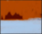
Background blocking
4. Blocking the fruit pieces
Next, I block the fruit. To follow with the proposed style, I use one of the brushes on the Dry Media kit. More specifically, I use the one called Chalkboard Tool in Affinity Designer.
This brush has jagged edges as if we were painting with chalk, and it provides a beautiful expressive outline to the initial sketch.
As you can see, I don't want to make perfect circles or one line sketch, but something loose. I also change the Flow and put it down to 40% on the contextual brush menu and leave the opacity and Hardness up to 100%.
Remember to create anew layer for them!
Another important setting when drawing with brushes is turning on the feature "Force pressure to control the size" on the same contextual menu. This way, the lines I trace will be thicker or thinner, following the pressure I apply to the brush itself.
Take any reference you find if you need it. And don't be worried about copying from it, as this is a learning exercise.
Regarding these lines for blocking the 2 pieces of fruit, you can also draw loose and relaxed, as we will put them in a layer and later on we can work more to adapt them to what we want. You will see how later on I will erase a bit the edges so they are not so thick and conspicuous.
I used a very dark blue colour for these lines since the floor is blue by now. But it could've also been warmer as the background. I will finally go for warm colours for the whole. In any case, and coming back to fauvism, I am free to use the colours in such a way they are full of contrast.

Blocking the main subject matter
5. Applying colour
At this point, I am going to create a Document (colour) palette out of what I have so far to facilitate my work.
On the Affinity Designer Swatches panel, go to the upper right menu and create a Palette from document as a Document palette.
You will have now a new palette with all the colours in the document to use to your convenience.
* If you don't rename the palette, it will take the name of the document itself. If the document hasn't been saved with a name, it will take the name "Palette"

Creating a palette from document
I create a new layer and pick a green base colour for the apple. The base colour is the foundation colour to which we will be applying highlights and shadows to create volume. Add this colour also to your Document palette through the Swatches panel, by clicking on the icon "Add current fill to palette"

Adding a fill to a palette
I move now to a different brush kit. I am now going to use something more "oily".
I open now the kit called "Acrylics" and start testing the possibilities within the different brushes. I finally decided to go for the brush called Smooth Blending Acrylic 02. I set the opacity down to 60% and Flow and Hardness 100%
In the new layer I just created I am going to apply the green base colour all over
the apple. I will create a new layer for the cherry and do the same, with one of the colours I pick from my recently created palette. Remember this will be a foundation or base colour. I do the same for the cherrie.

Adding a base colour
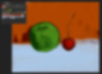
Using the same colours I picked for the base for each of the elements, I create a new layer and block the shadows. I apply a Multiply blend mode to these layers.

Shadow layers with a Multiply blend mode applied to it
6. Blending colour with DAUB blenders
Now, and even though I want a painterly fauve look, I want to blend a bit both colours together. For that, I am going to use the DAUB blenders by Paolo Limoncelli. You can download the kit at the bottom of this thread where you will also find a good explanation on how to install them (the same as you would install a brush kit in Affinity Designer or Affinity Photo).
With this kit you will be able to blend colours easily. They are fantastic for painting. When you install them through the Brushes panel in the Pixel persona, you will see there is a Smudge tool icon next to them. That means that, as you apply it, you will be smudging and not painting (see images below).

DAUB blender kit by Paolo Limoncelli

DAUB blenders applied over the shadow layers
7. Adding colour by cutting and erasing
Next, I create a new layer and this time I set the blend mode to Normal. I pick lighter hues for each of the fruits' colours to start adding a bit of highlight and creating volume. I also try to paint in such a way that I follow the rounded shape of the fruits.
Following up, I need to continue adding more hues for highlights. In this case I pick a brighter green for the apple creating a new layer and leaving the blend mode to Normal. In the case of the cherry I chose to pick the same previous red, but now I give the new layer an Overlay blend mode.

There is a technique I like to use here, which consists in deleting paint instead of laying perfect strokes initially. First, it is easier for me to control the whole painting, but also, I like a lot the cut paint look. The same goes for laying some of the strokes, which I do by pressing Shift and laying an initial point, to then move to a different place over the canvas while still pressing Shift. This will create a straight line or stroke.
I activate/deactivate the brush option "Force pressure to control size" as I feel I need it. Remember this is to force your stylus to control de size of your brush by pressing harder or softer over the canvas. I also change the options Opacity, Flow and Hardness to adapt to what I see works best.
As I always say, indications can be given, but the best you can do is experimenting on your own. Painting is not easy and controlling the techniques takes time, so don't be discouraged if things don't look as you'd like after your 20th attempt. It is a matter of insisting and getting familiar with the tool and options, among other things.
* TIP - Be sure to click Shift right after applying the first part of the stroke. Otherwise you will most likely get a diagonal line.
I add more hues to each of the fruits using always the same brush kit, changing if I feel one gives me a better result for each given part.
8. Fauvism: the wild beasts' colour palette
In Fauvism, colours express emotions and are not necessarily tied to reality. Colours are usually pure, bright and saturated and it is aggressively applied in such a way the result is a wild visual explosion full of power. Colours are used to reflect moods and other ideas different to that of the subject represented.

"Dance" by Henri Matisse

"The cat with the red fish" by Henri Matisse

"Summer Walk in London" by Ewa Czarniecka
Following these principles, I apply reflections to the apple and cherry in a bit of an "over the top" way, since there is a red reflection over the apple that goes beyond anything really possible and the same goes for the cherry.

Colour reflections
9. Casted shadow under the fruit
Next, I am going to add shadows below the apple and cherry, to put a base. I use the same technique I talked about before, painting and cutting paint later with the Eraser while pressing Shift to get straight strokes. I add a Luminosity blend mode to this layer so it will be showing the influence the background color no matter if I change it.

Shadows with a Luminosity blend mode

As you see in the two images above, I initially created the shadow using a dark blue colour, but then, I have decided to change the colour of the table where the fruit is placed. Since I applied a Luminosity blend mode to it, the shadow is now taking the influence of the new orange table and it is now dark brown. Very convenient.
To make the blue table orange, I have simple added a Vivid light blend mode to the layer.
10. Highlights
With an almost white colour and aways picking each white from the correspondent hue in the colour wheel, this is, from the green area in the case of the apple and from the red area for the cherry, I add highlights. You don't want to pick it from the wrong place on the colour wheel, as this will always show a portion of that colour. Make sure you pick it from where it corresponds to avoid this.

Highlights
11. Cutting out the excess of paint
Again, I use the cut (erase) technique to get rid of some of the paint I don't want. This way, I kind of sculpt the apple and the cherry to get a satisfactory result.
I can do this directly erasing the paint over a layer, or I can do this using a mask.
The advantage of using a mask is that erasing won't be a "destructive" action, but a reversible one. In the case you go over it again and feel you might have over-erased some parts, you can bring them back again.
To work with the last option (which I recommend), instead of using the eraser over the paint, you need to create a New Mask Layer (you find the option at the bottom of the Layers panel).
Now, instead of picking the Eraser, you need to pick the Brush tool and select a dark colour. The darker it is, the more it will "erase". Next, go over the paint you want to get rid of and you will see it disappears. To bring it back you simply need to use a white colour.
This is a very convenient way of working cause as I said, it is non-destructive!
I am going to do just that by removing some of the excess, especially for the outer stroke in the apple and cherry and give some more final touches until I consider my piece finished.
Additionally to this, I varied a bit the colour for the table and background by using brushes and blend modes. And as usual, I made several versions and it was hard to decide which one I preferred :)

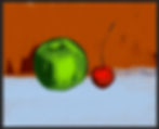
Artwork before applying a mask to remove the excess of paint
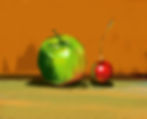
Final artwork
Final artwork version 2

Final artwork version 3 and I could go on forever...
You can watch a walk-through video and join the FB help group